Interactive reports by Datastory: transform data into dynamic stories
By Victoria Gladkiy • 10/10/2024
Transform static reports into engaging, interactive experiences with Datastory's interactive reports feature, making data accessible and impactful.
At Datastory, we believe that data is a story waiting to be told. Our Interactive Reports turn complex datasets into engaging, dynamic narratives that enable your audience to explore and understand your findings in a whole new way. Whether you're a researcher, policymaker, or an NGO, our platform helps you present your data in a format that's visually compelling, easy to navigate, and impactful.
What is an Interactive Report?
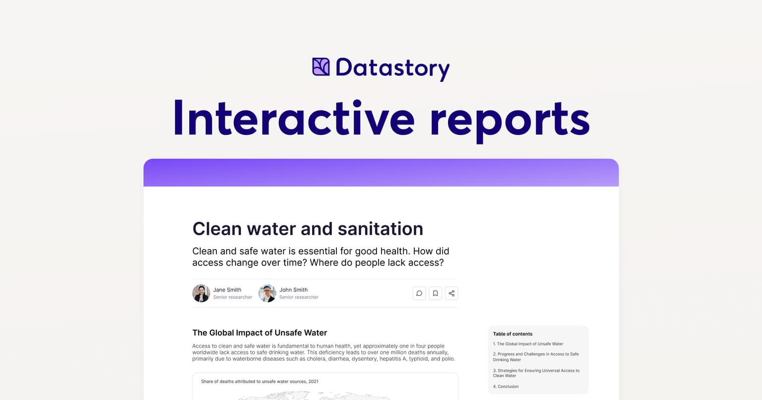
An interactive report is more than a document, it's a digital experience. Unlike traditional PDFs, which present static information, interactive reports empower your audience to interact directly with the data. Readers can click, filter, and explore interactive charts, maps, and datasets—uncovering insights on their own. This approach makes your content more accessible and actionable, turning data into stories that resonate with decision-makers, researchers, and the public.
Key Features of Datastory's Interactive Reports
- Dynamic Data Visualizations: From interactive charts and graphs to rich data-driven maps, our platform lets your audience interact directly with your data. They can explore trends, test assumptions, and discover insights.
- Customizable Templates: We provide a range of proven templates tailored to different sectors—research, policy, finance, or social impact. You can adapt these templates to your project, ensuring that your data is presented in the most effective way.
- Real-Time Data Updates: Your data doesn't stay static, so why should your report? With Datastory, you can update your interactive reports with real-time data, ensuring your audience always has access to the most current insights.
- Seamless Data Integration: Our platform allows you to pull in data from multiple sources, combining local and international datasets to give a comprehensive view of the topic at hand.
- Advanced Analytics Tools: Let your audience dive into the data with filtering, comparison, and drill-down capabilities.
Success Stories
Does Carbon Pricing Work?
In collaboration with the Swedish House of Finance, Datastory created an interactive report that evaluates the effectiveness of carbon pricing policies in reducing emissions, featuring dynamic data visualizations and research-backed insights. It provides a visually engaging way to understand how carbon pricing impacts industries and the environment.
Key Features:
- Interactive Comparisons: The report offers users the ability to explore industry-level data on fossil emissions, with intuitive charts that showcase the outcomes of different carbon pricing strategies.
- Data Visualizations: Users can engage with visuals to compare emissions from high- and low-emission industries and see how carbon pricing has influenced reductions over time.
Explore the full report here.
Designing a Carbon Tax Policy that Works
This interactive report, also developed for the Swedish House of Finance, provides a comprehensive look at designing effective carbon tax policies using interactive visualizations to break down complex economic concepts. Readers can explore how marginal carbon prices influence company behavior and emissions reductions.
Key Features:
- Dynamic Visualizations: The article features interactive graphs and diagrams that demonstrate how various carbon tax structures influence company behavior and emissions.
- Illustrative Content: With engaging visuals, users can explore how marginal carbon taxes create incentives for companies to cut emissions, providing clear insights into effective policy design.
Explore the full report here.
Use Cases for Interactive Reports
Academics & Researchers: Present your research in a dynamic format, allowing your audience to easily explore data, compare insights, and understand your findings more deeply.
Policymakers & Decision-Makers: Make data-driven decisions with confidence by presenting real-time, interactive policy data that's easy to navigate and analyze.
NGOs & Non-Profits: Turn complex data into clear narratives, inspiring action and driving awareness for your cause.
Corporate & Financial Analysts: Engage stakeholders with interactive financial reports, from market forecasts to end-of-year reviews, making data exploration easy and insightful.
Why Interactive Reports Outperform Static PDFs
- Dynamic Exploration vs. Static Content
Interactive reports allow users to interact with data—filtering, comparing, and analyzing it in real time—unlike static PDFs, which lock data into a fixed format.
- Real-Time Data vs. Outdated Information
While PDFs present a snapshot in time, interactive reports can be continuously updated with live data, ensuring your audience has the latest insights.
- Engaging Experience vs. Passive Reading
Interactive elements like clickable graphs, maps, and filters transform the reading experience, turning passive readers into active participants.
- Multimedia Storytelling vs. Text-Heavy PDFs
Interactive reports can integrate multimedia elements like video, audio, and animations, providing a richer and more immersive storytelling experience.
- Custom Interactivity vs. Fixed Layout
Users can personalize their experience with interactive reports by exploring data from different angles, something static PDFs can't offer.
Why Datastory?
With Datastory, you're not just creating a report—you're crafting an experience. Our platform combines data management, open data, and powerful visualization tools to help you transform complex data into compelling stories. Whether it's research, policy, finance, or social impact, Datastory's Interactive Reports elevate your data, ensuring it's seen, understood, and acted upon.
Get Started with Datastory Today
Ready to bring your data to life? Contact Datastory today and start creating interactive reports that engage, inform, and inspire.